Author Topic: Proper Skateboarding Update  (Read 49517 times)

0 Members and 1 Guest are viewing this topic.

baravettski

  • Trade Count: (0)
  • Full Member
  • ***
  • Posts: 165
  • Rep: 41
  • SLAP OG SLAP OG : Been around since SLAP was a mag.
Proper Skateboarding Update
« on: June 14, 2016, 09:58:56 AM »
Hey everyone,

Just wanted to drop a note on FTW and what's going on for anyone interested on the process.

Shit is weird right now, the industry is simultaneously exploding and imploding so we are gonna do our thing our way. Skateboarding needs a 'fuck you.' We want to make shoes that fit right, look good and can stand up to skateboarding and do so at an honest price. Footwear That Works...

Here's where we are currently:

Samples - I have one lasted upper sample so far, expecting the first weartest samples for me to check out in the next couple weeks. Thanks to you guys that hit me up about testing, I'll get at you when I have pairs to send out to people, probably more like July/August for those.

Models/Colors - Did some redesigns and shifting, I have four designs out, we are moving ahead with three for production, 2 colors each, I'll end up finalizing those in the next month or so, but there will definitely be some black/white and some white/gum. Maybe triple black and triple white too.

Team - I have some feelers out there, so far I got a local Portland homie, Cam Barrett who is a rad dude and gonna help out. This will also be easier once I have real samples to show.

Internets - We are most active on @ftwbrand on IG. My homie Drew is on board doing artwork and edits and more will come when samples get in.

As far as the rest of what's happening, I figured I would ask you guys what you want to see or know about. I didn't want to get too fancy and post a press release or some shit, so if you want to see sketches, line art, have any other questions or concerns about my history, whatever else, just let me know and I'll do my best to keep up. I'll answer if I can, if I can't I'll do my best to tell you why. I really want to make this a thing that skateboarders can feel like they are part of. It's not going to be easy, we are doing it on our own with our own money, but I still believe in skateboarding and want to contribute.

Thanks.


« Last Edit: April 03, 2018, 09:13:10 AM by baravettski »

Grind King Rims

  • Guest
Re: FTW Update
« Reply #1 on: June 14, 2016, 10:12:11 AM »
It's awesome watching you get this up and running from the get go and also coming to slap to discuss all your goings on. I really want to support this as best I can.

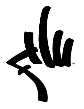
The "I don't like the name or the graffiti-style logo" points have already been made ad nauseam, so I won't get into that until I see the finished product.

I guess what I'd like to see is line art for shoes or as much of the end product as possible. The art, the shoes, the idea for ads, etc.

Thanks again for keeping us posted.

Fongstarr.

  • Trade Count: (0)
  • SLAP Pal
  • ******
  • Posts: 11445
  • Rep: 315
  • SLAP OG SLAP OG : Been around since SLAP was a mag.
    Bronze Topic Start Bronze Topic Start : Start a topic with over 1,000 replies.
Re: FTW Update
« Reply #2 on: June 14, 2016, 10:22:42 AM »
Man.....all this seems so promising but that logo is so bad.

This shoe looks okay though. White and gum are always classic.

I'll fuckin
I'll fuckin
sew your asshole closed, and keep feedin you
and feedin you, and feedin you, and feedin you!

shit_for_brains

  • Guest
Re: FTW Update
« Reply #3 on: June 14, 2016, 10:38:05 AM »
Man.....all this seems so promising but that logo is so bad.

It looks like the Jnco logo.

Sk.A.T.A.N

  • Trade Count: (0)
  • SLAP Pal
  • ******
  • Posts: 4143
  • Rep: 708
  • aka Sk.A.N.Y.E.
Re: FTW Update
« Reply #4 on: June 14, 2016, 10:43:45 AM »
Dude, as you know i can try to help you with some ideas for the shoes. I'm no expert but i would love to do it. Those line sketches on illustrator are really easy to do too. My advice (construtiva criticism) on that one fongstar posted. Try to avoid those stiched panels so close to the flick area, it would be a easy spot for blowouts. Also, try a diferent typography in the logo (graffiti one). Looks kinda outdated...  :-\

R.I.P RUSTY/FRIP

Eric ricks

  • Guest
Re: FTW Update
« Reply #5 on: June 14, 2016, 10:53:00 AM »
I like the "tag" logo.

Its giving me the middle finger

Cant comment on the shoe design.

Id hit up skatan on his willigness to help.

He does really nice illistrations that give a 3d perspective of the shoe.

Your idea might be amazing, but on paper , it doesnt look appealing to me. Its too flat

bumpnrun

  • Trade Count: (0)
  • SLAP Pal
  • ******
  • Posts: 2676
  • Rep: 44
    • Fairways & Flips avatar image
  • SLAP OG SLAP OG : Been around since SLAP was a mag.
Re: FTW Update
« Reply #6 on: June 14, 2016, 11:01:04 AM »
graffiti style company logos never come across looking good.

Even having a cool homemade font rarely works out. Hecox for Chocolate may be the exception.

Watson

  • Trade Count: (0)
  • SLAP Pal
  • ******
  • Posts: 8001
  • Rep: 2235
  • SLAP OG SLAP OG : Been around since SLAP was a mag.
    Bronze Topic Start Bronze Topic Start : Start a topic with over 1,000 replies.
Re: FTW Update
« Reply #7 on: June 14, 2016, 11:01:33 AM »
I like pretty much everything you're doing except for the name and especially the logo if you want honest feedback. I know you're hearing it lots, but I have to agree with the comments. The logo looks very dated and JNCO or Triple Five Soul or something to me.

But I think the shoe drawings you've posted on IG so far look great and I'm stoked on how interactive you're being.

Fongstarr.

  • Trade Count: (0)
  • SLAP Pal
  • ******
  • Posts: 11445
  • Rep: 315
  • SLAP OG SLAP OG : Been around since SLAP was a mag.
    Bronze Topic Start Bronze Topic Start : Start a topic with over 1,000 replies.
Re: FTW Update
« Reply #8 on: June 14, 2016, 11:08:39 AM »
I just think if you are spending this much money on making shoes, spend just a little more to have someone make a proper logo for you. I know logos for shoes can be unnecessary at times(State's logo is pretty non existent. Deklines was horrible but was fine towards the end) but it can also make or break a brand as well. Just don't plaster that thing on the sides of the shoe. Keeping that logo small helps a little but I noticed it's on the soles as well.

Other pics from the IG:


« Last Edit: June 14, 2016, 02:05:33 PM by Fongstarr. »
I'll fuckin
I'll fuckin
sew your asshole closed, and keep feedin you
and feedin you, and feedin you, and feedin you!

ZEBRA

  • Guest
Re: FTW Update
« Reply #9 on: June 14, 2016, 11:41:32 AM »
Thanks for the update!!!

I'm felling those black shoes that remind me of the Adidas Gazelle. I like the added ollie pad.

I've been liking all the designs so far.

I actually like the graffiti logo. Little different from what everyone else is putting out. Everyone seems to be very modest. Simple color ways with an edgy image would be rad.

Looking forward to seeing the final product!!!

Jordick

  • Guest
Re: FTW Update
« Reply #10 on: June 14, 2016, 12:21:56 PM »
Those gazelle and dunk inspired shoes look sick. I'd wear them regardless of the logo, which I don't think is great, but it's not gonna be as big as a swoosh, so fuck it. I think if the logo was a bit more uniform it could help

Such

  • Guest
Re: FTW Update
« Reply #11 on: June 14, 2016, 12:44:15 PM »
absolutely get rid off that logo. it looks outdated and it will be hard to make it work with a shoe.

is i to late to get on the wear test program? or is that impossible since im outside the us?

i would not start off with those 2 models though.

micky682

  • Guest
Re: FTW Update
« Reply #12 on: June 14, 2016, 01:47:03 PM »
I'd want the shoes to be true to size, and have the fit be accommodating to most feet types. Kinda like the Lakai Staple where you just put it on the first day and go. The last design looks really good, the one before the sole picture.

Jake From State Farm

  • Guest
Re: FTW Update
« Reply #13 on: June 14, 2016, 01:57:58 PM »
I agree with everyone else here, the logo is bad and it certainly fits with how bad the name is. Again, the name is more of a slogan than anything. Good luck with your endeavors, but I'll take a pair of States over this stuff.

Sk.A.T.A.N

  • Trade Count: (0)
  • SLAP Pal
  • ******
  • Posts: 4143
  • Rep: 708
  • aka Sk.A.N.Y.E.
Re: FTW Update
« Reply #14 on: June 14, 2016, 02:13:10 PM »
I'm not logo designer by any means but I had this idea... It's simpler and has the 3 letters in it too. I did 3 options but i could do more variations of it.


R.I.P RUSTY/FRIP

pointandclick

  • Trade Count: (0)
  • SLAP Pal
  • ******
  • Posts: 3282
  • Rep: 245
  • SLAP OG SLAP OG : Been around since SLAP was a mag.
Re: FTW Update
« Reply #15 on: June 14, 2016, 02:27:24 PM »
ive done some logo work and could help contribute. im interested to see how the shoes feel and fit. if you ever get 7.0 us made  let me know.

smellsdead

  • Trade Count: (+9)
  • SLAP Pal
  • ******
  • Posts: 2674
  • Rep: 1237
Re: FTW Update
« Reply #16 on: June 14, 2016, 03:40:12 PM »
hell yeah dude!
progress!

baravettski

  • Trade Count: (0)
  • Full Member
  • ***
  • Posts: 165
  • Rep: 41
  • SLAP OG SLAP OG : Been around since SLAP was a mag.
Re: FTW Update
« Reply #17 on: June 14, 2016, 04:47:05 PM »
Thanks everyone.

Finger logo - biggest place it will most likely ever be is on the bottom, I get it, not everyone is gonna dig it and that's fine. This is the one that I currently consider the "main" logo. But at least for now I don't want to go down the traditional path of "visual center, main illustrator type logo that looks like every other logo, etc." That said, if anyone wants to help out with some logo shit, I'm down to take a look too.


Yeah, Sk.A.T.A.N. is hella good at those renderings, and your'e right, they are usually used to spruce up a flat CAD for presentations, etc. The ones I've posted and you guys are seeing are what we send to the factory. I've seen whole sales teams get tricked by nice renderings and consequently, seen what should be really good shoes not even get to the next step because of shitty renderings in shitty colors.

Also, out of curiosity and I realize it's free market research, if you want to either comment or message me the last three skate shoes you bought, where you got em and how much you paid, it'll help down the line for distribution and what not.


baravettski

  • Trade Count: (0)
  • Full Member
  • ***
  • Posts: 165
  • Rep: 41
  • SLAP OG SLAP OG : Been around since SLAP was a mag.
Re: FTW Update
« Reply #18 on: June 14, 2016, 04:54:53 PM »
I'd want the shoes to be true to size, and have the fit be accommodating to most feet types. Kinda like the Lakai Staple where you just put it on the first day and go. The last design looks really good, the one before the sole picture.

Cool, thanks for referencing an existing shoe. You talking about the old Staples or that new one?


Eric ricks

  • Guest
Re: FTW Update
« Reply #19 on: June 14, 2016, 04:56:36 PM »
I'm not logo designer by any means but I had this idea... It's simpler and has the 3 letters in it too. I did 3 options but i could do more variations of it.


Love your work but that looks like it was designed by a skinhead on acid lol

Sk.A.T.A.N

  • Trade Count: (0)
  • SLAP Pal
  • ******
  • Posts: 4143
  • Rep: 708
  • aka Sk.A.N.Y.E.
Re: FTW Update
« Reply #20 on: June 14, 2016, 05:26:23 PM »
Expand Quote
I'm not logo designer by any means but I had this idea... It's simpler and has the 3 letters in it too. I did 3 options but i could do more variations of it.


[close]

Love your work but that looks like it was designed by a skinhead on acid lol

ahahah, it's just the bottom ones, the top one is just to show where the letters are...
It's just raw ideas tho, i like the middle one that looks almost like a clover/trefoil. It's kinda simple too. But yeah, this is not my thing.

R.I.P RUSTY/FRIP

Eric ricks

  • Guest
Re: FTW Update
« Reply #21 on: June 14, 2016, 05:30:58 PM »
Expand Quote
Expand Quote
I'm not logo designer by any means but I had this idea... It's simpler and has the 3 letters in it too. I did 3 options but i could do more variations of it.


[close]

Love your work but that looks like it was designed by a skinhead on acid lol
[close]

ahahah, it's just the bottom ones, the top one is just to show where the letters are...
It's just raw ideas tho, i like the middle one that looks almost like a clover/trefoil. It's kinda simple too. But yeah, this is not my thing.

Actually after a second look, the one you like is pretty dope. I like that one too

micky682

  • Guest
Re: FTW Update
« Reply #22 on: June 14, 2016, 06:23:21 PM »
Expand Quote
I'd want the shoes to be true to size, and have the fit be accommodating to most feet types. Kinda like the Lakai Staple where you just put it on the first day and go. The last design looks really good, the one before the sole picture.
[close]

Cool, thanks for referencing an existing shoe. You talking about the old Staples or that new one?


New ones, the fit is so good. Not too wide not too narrow.

sleepypancakes

  • Trade Count: (0)
  • SLAP Pal
  • ******
  • Posts: 3773
  • Rep: 228
  • Silver Topic Start Silver Topic Start : Start a topic with over 5,000 replies.
    Bronze Topic Start Bronze Topic Start : Start a topic with over 1,000 replies.
    Gold Topic Start Gold Topic Start : Start a topic with over 10,000 replies.
Re: FTW Update
« Reply #23 on: June 14, 2016, 06:24:50 PM »
If I'm being honest "Footwear that Works" reminds me so much of "Nice Skate Shoes" that I already know I'd never buy it. Graffiti logo aside (you need to fix that too).

I just don't want you to be these guys.

baravettski

  • Trade Count: (0)
  • Full Member
  • ***
  • Posts: 165
  • Rep: 41
  • SLAP OG SLAP OG : Been around since SLAP was a mag.
Re: FTW Update
« Reply #24 on: June 14, 2016, 08:15:38 PM »
If I'm being honest "Footwear that Works" reminds me so much of "Nice Skate Shoes" that I already know I'd never buy it. Graffiti logo aside (you need to fix that too).

I just don't want you to be these guys.


I also don't want to be those guys.

McCly

  • Trade Count: (0)
  • SLAP Pal
  • ******
  • Posts: 1966
  • Rep: -12
Re: FTW Update
« Reply #25 on: June 15, 2016, 07:17:56 AM »
The white/gum shoes remind me of the first Ellington Supra in a very good way. And I would skate the fuck out of those ollie pad Bruins. The Bruin SE was my favorite skateshoes ever once it broke down a bit. My main problem initially was that it was either too long or too narrow, so I had to juggle sizing up or down. (The New Balance Stratford is currently my favorite shoe. The fit is flawless and accommodating)

My biggest issue with the logo is that it doesn't really reflect the extensive design and consideration that went into the shoes.

Roisto

  • Trade Count: (0)
  • SLAP Pal
  • ******
  • Posts: 2745
  • Rep: 474
Re: FTW Update
« Reply #26 on: June 15, 2016, 07:39:55 AM »
I agree with everyone about the name and the logo. While I see the appeal in both, I don't see them working in shoes or anything else I'd consider wearing.

Other than that, I'd back a new skater owned shoe company that is sticking it up to the big corpos.

Maybe be edgier with your ads? No one over 13 really wants to wear any "edgy stuff".

144p

  • Trade Count: (0)
  • SLAP Pal
  • ******
  • Posts: 2681
  • Rep: 1068
    • 35th Ave Skates avatar image
Re: FTW Update
« Reply #27 on: June 15, 2016, 07:40:35 AM »
It would be A bummer to see a project with passion and dedication that is headed in a great direction be derailed because of A logo.
As A retailer/buyer and someone who watches buying trends, talks at length with customers about their habits and interests, it's a bit disheartening to hear you disregard peoples adamant dislike of your logo.
That kind of feedback is pretty valuable, and and after speaking with a few other shops about the brand, we all kinda feel the same way.
It's A corny logo.

micky682

  • Guest
Re: FTW Update
« Reply #28 on: June 15, 2016, 07:55:47 AM »
It would be A bummer to see a project with passion and dedication that is headed in a great direction be derailed because of A logo.
As A retailer/buyer and someone who watches buying trends, talks at length with customers about their habits and interests, it's a bit disheartening to hear you disregard peoples adamant dislike of your logo.
That kind of feedback is pretty valuable, and and after speaking with a few other shops about the brand, we all kinda feel the same way.
It's A corny logo.

Maybe block letters ala Baker, just straight FTW?

Pauly Walnuts

  • Trade Count: (0)
  • Sr. Member
  • ****
  • Posts: 346
  • Rep: -5
Re: FTW Update
« Reply #29 on: June 15, 2016, 09:06:47 AM »
Changing the logo to be even more legible would only make it more obvious at how bad the name is.
haha
"I told you a long time ago you fucking little monkey not to fuck me"-Alejandro Sosa