From a photography standpoint, I like the Suciu ad better. In photography, the brightest parts of the photo and the biggest thing in the photo naturally and instantly draw your eyes.
The Kalis ad with LOVE sculpture being in color as opposed to all black and white screams photoshop and is a tired gimmick used in wedding/amateur photography so sadly that detracts from the timelessness of this image and naturally draws the eye to it instead of the skateboarding happening next to it and is almost equal in size or even larger than Kalis is in the photo so the skating carries less weight visually.
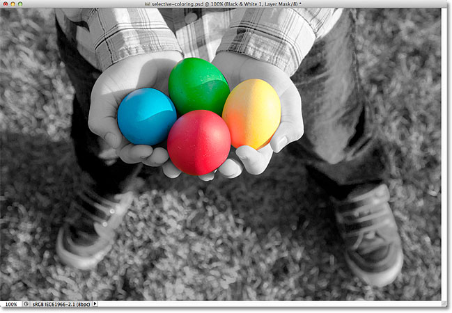
I'm sure everyone has seen countless images photoshopped like this by now:
The Adidas layout is similar in some ways so the biggest crime the graphic design department at Adidas committed is plagiarizing that lower white space for text. I feel that incorporating a triangle for the text would have been more effective. Triangles also naturally draw the eye so a triangle below Suciu skating would draw you to his name/trick name and actually also act as an arrow to direct your gaze to the skateboarding above it.
Instead of saying "Introducing", the logo with the circles inside a triangle below the shoe they are trying to sell would again draw your eyes to it and direct your eyes like an arrow to the shoe above it.

 Topic: Kalis facebook post (Read 56122 times)