graphic designer needa be fired over this one
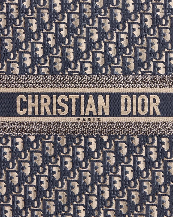
I guess it's meant to be this, but as a Dior pastiche, it's lazy. Why does the pattern just end abruptly before the bolts? It doesn't even finish naturally it's just cropped middle of the D at the bottom. If it's meant to look like a luxury brand why does it feel like they wanted them produced as cheaply as possible? The ink in the pattern should be in the negative space (ie. the colours should be reversed), which also makes it look off.
Why add the white? It's meant to mimic a single colour embroidery, so they added another colour for no reason. Maybe the designer gets paid per colour? Maybe they have more white ink? If it was all gold and the graphic ran the full board it'd still be bad, but probably look better.
The logo type looks like it came straight from Illustrator. The "Di" kerning is too tight so it reads as "Di l o" (the "il" and "lo" pairs aren't great either). Start with the existing logo the "Di" in the original doesn't look like that, so there's no reason yours should.
I get that they want a recognisable logo, but there's probably a reason Dior wouldn't use that one for that type of application since it leaves a bunch of awkward whitespace around it. They could have gone with the more modern all caps version of the logo, but I'd say that having to replace the "R" with an "L" made it not read as Dior.
There's nothing really wrong with an obvious idea, but maybe spend more than 30 seconds looking at what you're replicating.

 Topic: Worst board graphics ever? (Read 79671 times)